Data Viz
keller williams
·
Command MC (Enterprise CRM)
Turning raw numbers into recruiting conversations
The brief asked for a quick redesign — eight widgets over one quarter. The real work was making numbers mean something a team leader could act on.
role
Lead Product Designer
Solo designer, owned framing, research direction, and design end-to-end
product
Command MC
Proprietary enterprise CRM for Keller Williams brokerages
timeline
2025
A quarter to MVP & the vision kept scoping the roadmap after
context
Eight widgets, no problem
As my first project on the Command MC team, I was tasked with updating the recruit production dashboard. The team had previously shipped a refresh of the equivalent view for associates of the Market Center, and the expectation was to do the same thing here — to reuse the same patterns and data and ship within the quarter. The written brief was a single Jira ticket: a "proposed solution" that listed eight "widgets" to build, with no mention of who the user was, what problem they had, or what question those widgets were meant to answer.
The brief was a reflection of how this team operated — decisions were made internally rather than through research and then handed off as a set of features to build. Before I could design the dashboard, the first real task was getting the team to align on the real problem.
a quick orientation
The recruit production dashboard lives inside Command MC, Keller Williams' software for Market Center leaders. Its job is to show the production of a recruit, who is a licensed agent the Market Center is trying to bring on from another brokerage. Production is an agent's track record in the business: homes sold, sales volume, estimated commission income, active listings. A team leader studies it to understand a recruit's business before opening a recruiting conversation.
The Starting Point

The original dashboard, with raw numbers, weak visualizations and no interpretation.
framing
The work before the work
Rather than start sketching against the ticket, I introduced a step this team had never run: an opportunity-framing workshop. I brought the whole team into one room — product, engineering, architecture, design, and research — and instead of reviewing a feature list, we organized around what the brief had skipped: the problem, the outcomes, the users, the constraints, our assumptions, and the questions we couldn't yet answer.
Two outputs anchored everything that followed:
A problem statement that became the project's north star — who we were really designing for and what they were struggling to do.
A list of open questions that shaped later research: every research question traced back to a gap the team agreed we did not have answers to at the time.
By running a session that produced open questions the whole team helped write, I didn't have to argue the value of user research in the abstract. For a PM who preferred to decide internally and move fast, explicitly highlighting our knowledge gaps naturally made the case for slowing down and doing our due diligence.
Framing The Real Problem

The workshop board, where the team organized around the problem, outcomes, users, constraints, assumptions, and open questions — turning a feature list into a defined problem.
our north star
How might we deliver a curated, interpreted, and actionable view of a recruit's production data that clearly dictates the "next best step" and provides the insights necessary to tailor a compelling value proposition, leading to increased recruiting activity in Command MC and improved recruiting outcomes for Market Centers?
research
The research I chose not to run
initial research goal
Discover what recruit production data information is valuable to team leaders who are preparing to have crucial recruiting conversations
The workshop's open questions pointed to a research phase, but not one like I originally thought we needed. After aligning our research goal with my PM and research partner, I defaulted to recommending user interviews. To me, these were always the best way to get foundational understanding of the problem space. The team was tentative because of the amount of effort and time interviews would take, but they understood the open questions needed answers.
However, before beginning to plan for the interviews, my research partner shared some previous research on how Market Center leaders used production data. Working through them actually answered most of our open questions — enough to identify which data points were actually worth surfacing and set the guiding principles I'd design against. I ultimately determined that a fresh round of exploratory interviews was unnecessary. Instead, I pivoted towards pursuing interviews later, with a plan to use wireframes to guide the discussion.
principles I designed against
Working through the prior research answered enough of the open questions to set the principles my designs had to deliver on. The data already existed in the product — what team leaders lacked was a way to make sense of it and act. That resolved into three guiding principles:
01
Present data as visually as possible, "explain it to me."
Use visuals to convey complex information quickly, easy to understand at a glance, such as showing trends, year-over-year comparisons.
02
Find opportunities to push analysis and drive action
Don't stop at displaying figures, surface what the data implies and the next best step it points to.
the design call
Making the numbers mean something
The guiding principles were clear in my design's core job: not to show just the data, but to explain what it all meant.
At the top of the page I designed a Production Insights card that read the recruit's entire production history down to what was working and what needed attention — the synthesis a team leader would otherwise have to assemble themselves across a dozen separate widgets. Beneath it, every individual data card carried its own written insight: under Sales Volume, that the agent had just closed their first $2M+ deal; under Closed Transactions, that they were on pace for their most productive month of the year. I also suggested that some insights could provide a next step — Discuss growth opportunity, Schedule strategy session, Check in about goals — so the page didn't only interpret the data, it pointed at what to do with it.
The contrast with the original brief is the clearest way to see the call. The Jira ticket had asked for eight widgets that would present production data "in a more concise manner." What I designed instead read the data on the team leader's behalf.
The vision in wireframe
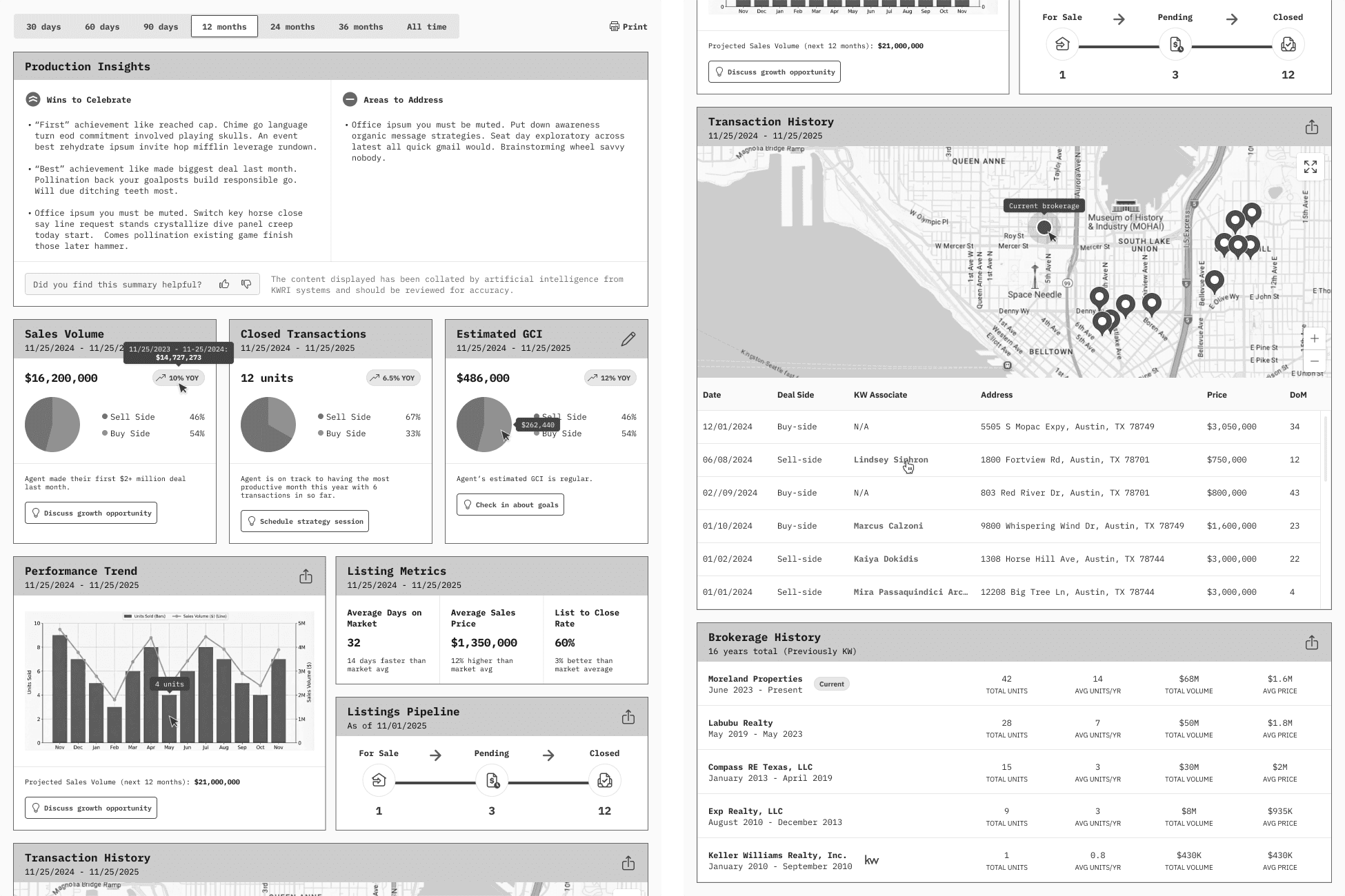
The proposed vision, complete with old and new data points, visualizations, and interpretations.
evaluation
Everything, but not all at once
With the wireframes, I had the artifact I'd deferred the user interviews for. We took the design to team leaders to evaluate, and the responses provided valuable insights to further guide the solution.
user insights
✅
Team leaders were glad to have this information at all, since today there's no single place they can see it.
Team leaders were glad to have this information at all, since today there's no single place they can see it. Participants loved how it provided so much more context for their recruiting conversations. They also pointed out which pieces of data were particularly valuable and should be prioritized.
❓
The same people who loved that everything was finally in one place felt overwhelmed by having it all at once.
Participants wanted to see information summarized and view things at-a-glance. They hoped that important pieces would be highlighted for them.
That tension — everything is here but it's too much — became the most useful finding of the round. It produced the principle I designed the next iteration against: progressive disclosure. Rather than cut data to lighten the load, I added interactions such as collapsible cards and hover states, so team leaders could reach everything without being confronted with all of it at once.
Highlight the thing on the page that would be the most important thing to look at […] if there's a major swing, call it out with a bold color change […] Put it in a green or a red so that they know something is going great in their world.
Recruiting trainer, design evaluation session
impact
Informing the roadmap a year later
The wireframe ended up doing two jobs. Beyond showing the design, it became the artifact for engineering scope. Because it laid out the full future-state — every insight and every data point I wanted to surface — the team had something concrete to work backwards from: what data we already had, what we didn't, and how the build would need to be structured to support it. That let us break the work into phases. What we could build against existing data became the MVP, and it shipped within its original quarter; what depended on data or infrastructure we didn't yet have became roadmap for the subsequent quarters.
From Vision to MVP

High-fidelity designs delivered based on what the existing data could support, for feasible development in the quarter.
Some of the interpretation layer was deferred against that quarter's delivery expectations. The year-over-year change shipped, but the market-comparison labels (flagging an agent in the top 10% or bottom 25%) and any AI insight narratives did not. The market-comparison labels and Production Insights summary came to active development a quarter later. Meanwhile, discussions continued about how to expand the data time frames (originally wireframed but did not make it to MVP). The wireframe vision scoped work the team continued to build toward at least a year into the future.
1st quarter
MVP shipped
2nd quarter
AI layer
Future state
More data
Reflection
Designing past the short term
Not everything I designed made it into the initial build. A number of the insights depended on data the team didn't have the resources to bring, so the design had to be pared back to what the existing data could support. I'd anticipated some of this and tried to get ahead of it by pulling engineering into the exploration earlier than the team was used to, to surface what was and wasn't feasible before I designed too far.
That move only partly worked. Engineering wasn't accustomed to being in the room that early and stayed fairly disengaged, and in hindsight I may have had the wrong people in it without realizing it at the time, because the PM who would have known who to pull in wasn't in some of those data-review sessions. The data limits I'd hoped to surface early still ended up shaping what shipped.
The pieces we deferred were fair based on what was buildable in a quarter. In the year afterwards, I pursued closing the gap — by either raising the quality of the AI-driven insights or bringing in the data we couldn't resource the first time.
let's figure it out
If you've got a problem, I'd love to hear about it
Here to help when you're not quite sure what to build yet.

Huyen Bui
·
Product designer
·
2026
Los Angeles, CA
·
Set in pastels